Okay Okay Okay. My site is coming along nicely. But, it’s still a construction zone.

It’s still got a lot of type dummied in, and all kinds of building blocks – art, structural items, discarded text, etc. – thrown about, willy-nilly, saved aside in case I decide I want any of that stuff back. I learned my lesson tonight. Delete nothing.

I threw out a piece on Cervantes. An hour later, I wanted a passage out of it. I knew it was still on the (long unvisited) original site but I couldn’t figure out how to switch over in the editor, and I couldn’t go directly, I’ve forgotten how it was named. I had to find an old Facebook post, hit the link, and because I still couldn’t get to the editor through that back door, I had to copy and paste first into a word doc for permanent storage, and from there into my new site. Like I told them on Facebook, I sure am no expert. I just klutz around until I like what I see.

Well, the site is still a mess, but the menu is working. You can go on there and navigate around, finally.

I have added a page at the end: The Writer Coop Annex. I have a look mocked up. My idea is to post titles and a line or two of our marvelous posts, with links to here. Also some of my own content, why should you visit Writer Coop? What will you find there? And so on.

It’s gonna be a while (months) before I’m ready to rumble, to promote my site. I would hope that our WordPress layout gets more visually exciting beforehand. I’m willing to work on it, if everyone agrees. Take a look at my Writer Coop page and give me your opinions. I think it takes more than what we currently have as a set-up to impress and entice new members. I see this as a serious stumbling block. Does anyone else?

FYI: The actual width of my W-C page is the width of the menu bar, plus a smidge. I always have to cheat a little.

Screen Shot 2016-10-30 at 11.25.30 PM.png

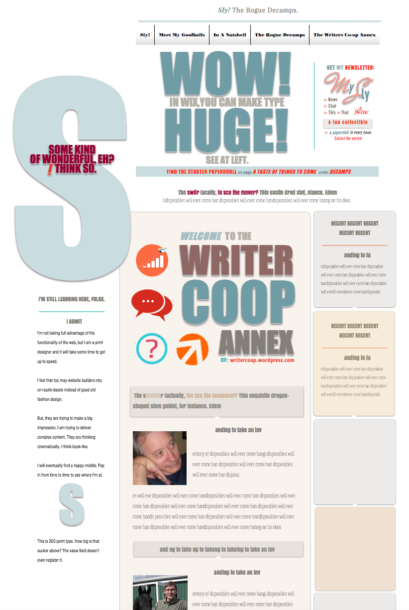
The header will have copy tailored to the page. The Sly info is repeated, but I have tried to minimize it. I wanted to make the FIND THE STARTER PAPERDOLL banner not visible for the Coop page. That caused other problems, so I’m leaving it for now. I should try again to get rid of it. On this page, it bothers me. I ought to dump the My Sly as well, and paste it individually page by page instead of the universal insertion. It won’t be too much more work. The menu bar (naturally) will stay.

Another problem, some lines of type are displaced. What you see in the editor sometimes jumps up or down in the public-view. There are many little things that I don’t have a handle on yet.

It’s pathetic how I stumble around in Wix. I discovered only a day ago that I can make the type huge. I’d thought you could only go up to the limit of the slider bar. No! There is a field to plunk a number into. I thought the max must be around 300 point, I think that’s the limit in inDesign. (It may be 400 pt., but no higher.) I entered 999 by accident and – bam! – there it was, a monster. You want that from time to time, to make a statement. This is crazy. And great. As Steve Jobs used to say, crazy great!

On the finished page, the SOME KIND OF WONDERFUL column will be gone. The WOW! HUGE! will be replaced by a meeker message, making for a considerably calmer page, not nearly so bouncing-off-the-walls.

Here’s the address of my site: http://mimispeike.wixsite.com/myguysly. Copy and paste it into your browser. I don’t know how to make it go live. See? I am pathetic.

______________________________________________

Rats! I just patched over the STARTER banner (on the live site), but you can see the edges of the patch. If I turn off the default display (anything in the header shows on all pages, until you opt out) then the type falls behind the strip and will not stay forward, I’ve tried and tried and tried. Mysterious. Maybe I’ll find a fix eventually.

_______________________________________________

You know, I would also like if the right column were wiped out, the left text as is, on a plain white ground, and in place of the oversized ‘S’, the cover of someone’s book, occupying the same space, a promo/review below. A regular feature: Book Of The Month. Or: Author Of The Month. Or a profile of someone’s main character: Meet Magali Rousseau.

I might even like that more. (In terms of style.) I think I do like it even better.

Here’s a question for everyone. GD says the sides of my page are cut off on his smallish screen. (I have the huge iMac, I don’t have that problem.) The actual page is only the width of the menu bar. The rest is fluff. Please tell me, is that menu shown in full on your computer screen? It is drawn within the Wix guidelines, so I find this very troubling.


16 responses to “Some input, please.”

  1. GD Deckard Avatar
    GD Deckard

    Gee I dunno Mimi, advising you on web design might be like telling Picasso to get his eyes checked. Mechanically speaking though, you might try putting everything into a table set at 90%, because right now, your page runs off the edge of my monitor. One more thing, the page loads slow for a first time viewer. if you resized your graphics to have fewer pixels, the whole page would load faster. (It may seem fast to you because it’s already stored on your hard drive but when a new viewer logs on, they have to wait for the download and some people just won’t.)

    I love the energy so evident on your site. It’ll be great when finished. BUT, WAIT! A web site is not a book or a brochure. A web site is never finished. You may find more satisfaction in completing the Home Page and then adding pages & changing things over time. That beats the ongoing frustration of trying to complete the whole site because a web site is a living thing. It can grow and change with your ideas.

    Like

  2. mimispeike Avatar
    mimispeike

    This is helpful, GD. Tell me this: when you say the pages run off the sides of your screen, I mean the page proper to be only the width of the menu bar. Is the bar itself cut off? That is the width of the guidelines on the Wix template. Everything else beyond that, I mean it be be a background, to amuse those with wide screens. A wallpaper, like what a lot of people use, meant as filler, but maybe viewers won’t realize that, because the content will be related to the story. Mayhap I must rethink that.

    So, is the menu bar displaying in full? The pixel issue, I’ll study that. But all my images so far were pulled off the web. I should think they would be at a low ppi.

    Problems after problems after problems. Grrrrrr . . .

    It just occurred to me. Pixels are not points. Have to get that straight in my mind. I have to do some experiments. Speed of loading is something I have worried about. There are sites with lots of images. How do they handle it? Time the current loading speed for, say, the Rambling Boy-o page. That’s a large image, we should see a difference there.

    Hold it. It comes back to me. I have images out of my books, scanned at 300dpi. I had just grabbed art I had lying around, to cobble a layout, intending to rescan later. My husband’s ancient scanner produces fidgets in the images, if you look closely. I will rescan at – 72? 96? – see how/if it has affected the quality, and I depend on you to give me a follow up report. I’ll let you know when I have made the change-over.

    Liked by 1 person

    1. GD Deckard Avatar
      GD Deckard

      One way to keep everything showing on the viewer’s screen is to place everything inside a table that is then set to size itself at say 90% of the page size.

      There are good cheap programs out there to make graphics “email ready” or “web ready.” They usually give good results.

      However, I have not kept up with the latest in web development. There are ways to make your page show on any size screen, including cell phone.

      You could also get Microsoft’s Expression Web 4 program for free and create your web site. Then, put it on a commercial server. Cost for having your website on 1and1.com, for example, is currently 99 cents a month. The real advantage here is that Expression Web 4 has everything you need, including easy table setup and a little feature that optimizes your graphics at a single click. You’d have to learn Expression Web 4 but it’s wysiwyg (what you see is what you get) and it has to be easier than Wix!

      Like

  3. mimispeike Avatar
    mimispeike

    Mobile-ready apps reconfigure the page. I don’t want that. I intend to create a pared down phone-ready feeder/companion site. Your other suggestions, I will research. Thanks. You sound like you know more than I do.

    But you haven’t answered my main question: Is the menu bar also cut off, or just the frou-frou at the sides? The wallpaper may not be a good idea after all. People may think it contains story information, though it is meant to be purely decorative. Why can’t I bite the bullet and produce a basic site? I’ve never been able to do that. I offer, in evidence, my novel Sly! A Rogue, Reconsidered.

    I’ve already skinnied it up. I can skinny it up some more. Keep in mind: the guts of my page are within the Wix recommendations (but barely). Do they not suffice?

    Liked by 1 person

    1. GD Deckard Avatar
      GD Deckard

      O 🙂 The horizontal menu bar along the top of the page is not cut off. But, other than the edge of something to the screen left, nothing else shows even when I scroll down.

      Like

  4. mimispeike Avatar
    mimispeike

    Thank you so much. That answers some of my questions. What a relief!

    Liked by 1 person

  5. mimispeike Avatar
    mimispeike

    My other main question was, does everyone think the current WC set-up is fine? I bow to the majority opinion on here. But style puts your message across, I do believe it.

    Liked by 1 person

    1. curtisbausse Avatar

      I get the same as GD when I visit the home page (the address you gave above) – the text is all skewered off to the left. But all the other pages seem to work fine. More generally I agree with GD that the site has great visual appeal and lots of creativity – but if you go for something simpler to start with, you can always add to it later. Just a matter of how much time you want to spend on it when you still have to publish the book.
      On your other question, sure, this site’s appearance could be improved. Options are limited in WordPress, though – just the range of different themes they provide (it’s very easy to test them and change theme if we want). That’s the price to pay for simplicity of use.

      Liked by 1 person

  6. mimispeike Avatar
    mimispeike

    I’m glad to hear that the other pages work. The left side of the Coop page was an afterthought, an add-on to try another way. If used, the right side would have to disappear, the rest shifted right, centered under the menu.

    My plan for a background (lots of people have backgrounds, heavy on fireworks, starry skies and bucolic landscapes), a movie-poster style trailing collage of character studies may not work, it may lead viewers on small screens to believe they are missing important stuff. It may be best to create a conventional repeat/motif (the kind of thing you often see on endpapers) and leave it at that. Why do I resist that? It would make my life much easier. It’s so predictable. I hate predictable.

    All I want to do is add an amusing space filler for the folks with the wide screens. My nod to motion might be, Wix will animate items, images or pieces of type, allowing them to land ker-plop on your page at your chosen intervals, even to fade in gradually. It’s an interesting small effect.

    I am very relieved that I have gotten the width right, finally. I do plan on publishing as soon as I have the intro pages and the first three chapters ready (that mostly means the art). I will then make the remaining pages invisible and add them one by one as I go, my version of serialization.

    I will hide the Coop page as well, and perhaps convert it to my own use. I can see it being the basis of a mobile-ready site, edited down, information narrowly stacked, the big S replaced with a big smiling Sly, the first thing you see. A quick-peek thing with a link to the full site.

    All these comment have been very useful to me. Thanks to all.

    Liked by 2 people

  7. Candace Vianna Avatar

    Hey Mimi, I just checked out the site (firefox browser.) I really like the graphic feel your going for, but it looks like your page width might be off. The entire page should display without a horizontal scroll bar. Could your background width be messing that up? Here’s another thought that I’m sure you’ve probably considered, but just in case: would it be more practical to take a template that has the layout you want and customize it rather than reinventing the wheel. How much is this costing you in time?

    Best of Luck Candace

    Liked by 1 person

  8. mimispeike Avatar
    mimispeike

    Thank you, Candace. This is the input I need. The Writer Coop page is not the width of the other pages. I been playing with it, trying things out. How are the other pages? That’s what I intend for the Coop page also. What screen are you on? This is not set up for mobile. I will address that presently, with a companion site. Thanks again.

    Liked by 1 person

  9. mimispeike Avatar
    mimispeike

    I am having a meltdown here. I am suddenly unable to get into the Wix Editor in Chrome. I can do it in Safari. I have reinstalled Chrome, but perhaps have missed a step, it still doesn’t work. Who is on a Mac and knows, step by step, how to uninstall and then reinstall Chrome? I’ll calm down and try again tomorrow.

    Liked by 1 person

    1. GD Deckard Avatar
      GD Deckard

      Here are uninstall instructions from Google Support.
      https://support.google.com/chrome/answer/95319?co=GENIE.Platform%3DDesktop&hl=en

      1. At the bottom of your computer screen, in your Dock, right-click Chrome.
      2. Select Quit.
      3. Open Finder.
      4. Go to the folder containing the Google Chrome application on your computer.
      Tip: It may be in your Applications folder. If not, go to File and then Find, and search for “Google Chrome.”
      5. Drag Google Chrome to the Trash.
      6. Optional: Delete your profile information, like bookmarks and history:
      a. At the top of the screen, click Go and then Go to Folder.
      b. Enter ~/Library/Application Support/Google/Chrome.
      c. Click Go.
      d. Select all the folders, and drag them to the Trash.

      Like

  10. mimispeike Avatar
    mimispeike

    Thanks GD. (Sigh) I did all that and it didn’t work. Well, I didn’t delete the profile info. I’ll try that.

    Liked by 1 person

    1. GD Deckard Avatar
      GD Deckard

      I think those people who told us that computers would make life easier are the same people who told us that pay TV would be commercial free.

      Like

  11. mimispeike Avatar

    A fix, of sorts: I have installed Firefox, and that works fine. (On Safari. I seem to have a page cluttered with guidelines, with something, not as clean a view. God knows why.)

    Like

Leave a comment